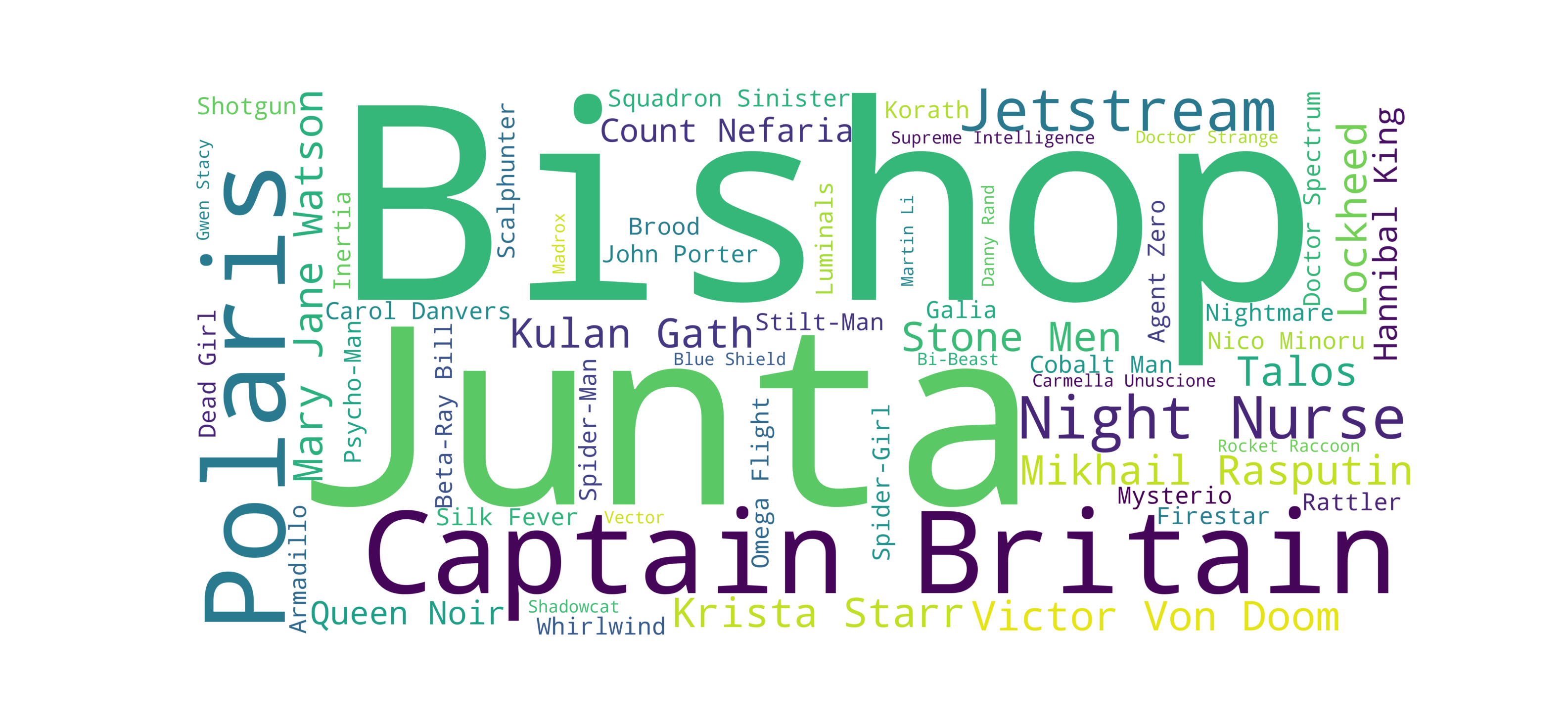
representing metrics as words cloud
I was working on a presentation of an internal service I’m working. In the service we have many entities (sorry, no details here for now), each generates inbound and outbound traffic.
Preparing Data
The service has an endpoint with whole metrics we collect. That is an enormously huge JSON file, that one can fetch from an HTTP endpoint.
There is too much data event to feed some Grafana solution. So we need to filter/normalize the data first.
I use amazing jq. Great tool to update/fetch/patch/present data. On macOS
you may simply say brew install jq to have it.
Fetching data in the console can be done simply too. I use curl for that.
The finally, to prepare the data, I use to following snipped
curl -s http://gh-prod-blue-backend-01/~api/manage/metrics | \
  jq --raw-output \
  '[ .block[] |  { key: .id, value : .counters."outbound-traffic"  } ] | del (.[] | select(.value == null ) ) | from_entries '
The output from the tool was like the following
{
  "entity-name-1": 39090,
  "entity-name-2": 5533,
  "entity-name-3": 13750,
  //....
  "entity-name-N": 7235017
}
That is the data to feed into a words/tags cloud generator.
Generating a Tags Cloud
I failed to find any good online service to implement the task in several clicks. Finally, I found a fantastic Python library called word_cloud.
Frankly, I’m not a python expert. I found an example and managed to turn it to my need in PyCharm.
That is the snipped I finally did
import json
import math
from wordcloud import WordCloud
import matplotlib.pyplot as plt

theData = json.loads(" { 'json' : 'data is here' } ")

print theData

theDataMax = max(theData.values())
theDataMin = min(theData.values())

##
## normalize the data first
##
theData = { k: (math.e + float(v - theDataMin) / float(theDataMax - theDataMin) )
            for k,v in theData.items()
          }

print theData

# Generate a word cloud image
wordcloud = WordCloud(background_color="white", width=2200, height=1000, margin=0,
                 ranks_only=None, prefer_horizontal=.7, mask=None, scale=2,
                 color_func=None, max_words=300, min_font_size=4,
                 stopwords=None, random_state=None,
                 max_font_size=None, font_step=1, mode="RGB",
                 relative_scaling=.5, regexp=None, collocations=True,
                 colormap=None, normalize_plurals=False)\
    .generate_from_frequencies(theData)

# Display the generated image:
plt.figure()
plt.imshow(wordcloud, interpolation="bilinear")
plt.axis("off")
plt.show()
Conclusion
I’m happy I came across several amazing tools, and it turned to be easy and fun to generate some analytics ‘reports’ like that:

I use Marvell character names instead of real names :)